What colors will rule the runways in Summer 2020? What shades will reach the streets and what hues are a complete no-no for a style-conscious person this year.
Here are answers to the Pantone questions of this year as renewed excitement, feminist consciousness, and empowered womanhood become the central themes and inspirations to the current narrative. Unsurprisingly, the summer colors this year are not limited to the traditional pastels and delicate shades – in fact, they’re bold, sharp and daring – just like the women of 2020.
No matter which part of the world you live in or what is your occupation – choosing the right color can make a lot of deference not only in your presentation to the world but your confidence in self.
The Pantone Institute has borne the responsibility of introducing the year’s colors of the world for many decades. This year, it has announced 12 incredible colors which will rule the palette this year. Warm shades in rich palettes, inspired by the fall and rediscovered in pastels.
A smaller palette is also released for business, work and utility clothing. A perfect fashion decision lies in making the most of these trending colors within the range of your existing wardrobe and sometimes reaching out to the new and experimental. Let us explore some Pantone and regular colors spotted on the red carpets and runways for Summer 2020.
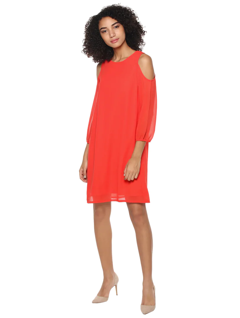
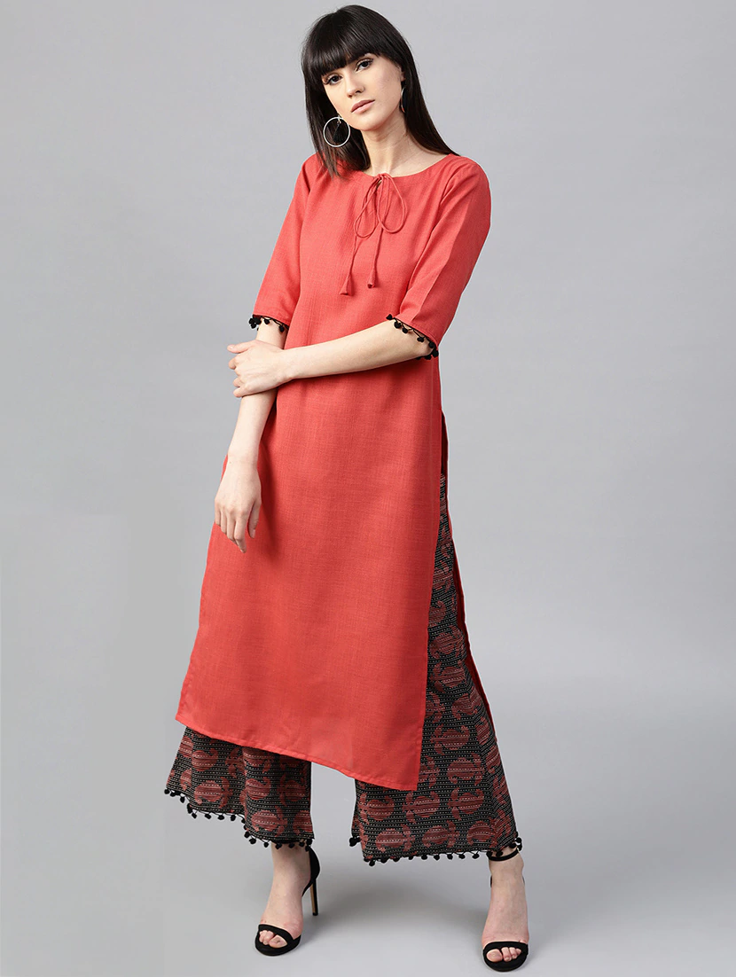
Living Coral
A bit of gold and a soft coral – the best of both worlds. Living Coral ( Pantone Color: 16-1546 ) has been named the Pantone color of the year for 2020. Warm but bright, organic but bold. It is a mix of peace and passion, just the right balance. Its mellow nature is ideal for most skin colors. The warm color makes the face look healthy and supple. From the beaches of Florida to the runways of Paris, this color has empowered the outfits of many celebrities and models.
Fiesta Orange
A daring color and a festive spirit – the perfect embodiment of the millennial woman. It represents fun and energy while also standing for bold and blatant courage. It is for the modern woman who can be both – a charmer and a conqueror. 17-1564 in the Pantone shades – this color is also a brand new shade of sexy. Great for both casual and formal use – it can be adapted and paired effortlessly. A tribute to the daring diva of the 21st Century.
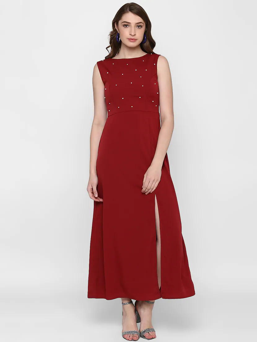
Jester Red
The intense and classy shade of 19-1862 jester red is one of the most soothing reds there is. It is not tacky, it is not loud and it’s definitely not difficult to mix and match. The color’s warmth and subtle boldness are like a weapon to the stylist’s advantage. A modern shade to suit the urban wardrobe’s every need. This color goes beyond the standard dress style and comfortably settles on pants, shirts, and even swimwear. It goes well with the spirit of spring and just like a little black dress, ladies should keep an eye out for the jester red dress trend. You can pair a well-fitting jester red blouse with the classy white bell bottoms to the skinny black pants. What adventure will you choose to go on with the red?
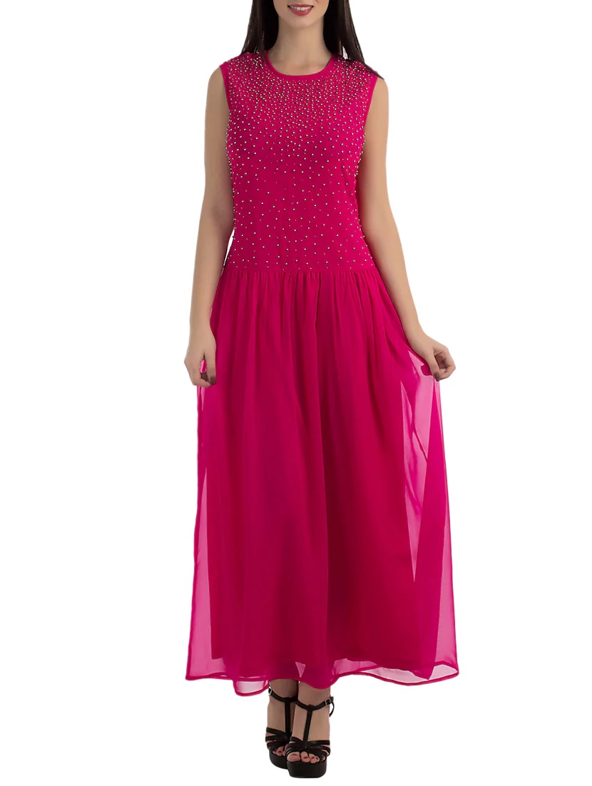
Pink Peacock
18-2045 on the Pantone list and a gush of fierce magenta. It is a daring but beautiful inclination of mauvish-crimson. Adding youth to class, it has been well liked and much exploited on the runways and red carpets alike. While it is considered a difficult shade to carry, it effortlessly mixes and matches with pastels and soothing colors to make an outfit. The best of spring and summer in one shade. It is for those who dare to venture beyond the conventional and embrace large sleeves, oversized coats, and everything fun. To think that this color is limited to a certain age group would be a mistake, it has the ability to add life and color even to wrinkles and grey hair.
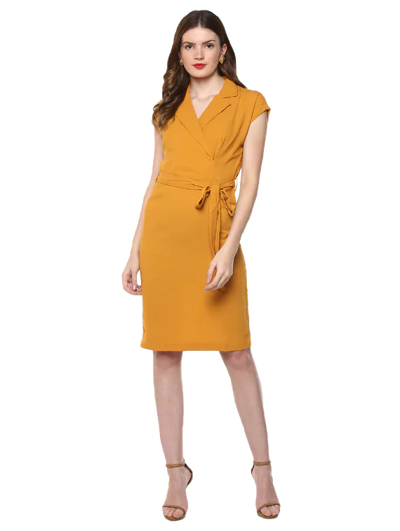
Turmeric
Inspired by the striking yellow of the curcumin spice – this shade is nothing short of spicy. It is yellow, it is bright and it brings vibrancy to even the dullest rooms. The runway has definitely accepted its yellows with some skepticism but this exotic color can be considered an exception. It is not glaring like it’s other yellow counterparts and yet it’s not dull towards the orange-yellow mix side of the shade card. It is the perfect summer jacket to go with a cute dress and a straw hat. It is lively and radiant while maintaining a classy undertone. Luckily, the shade has worked very well with the tans, greens and even monochromatic outfits. Audiences have appreciated how the color compliments the skin and adds a healthy glow to the face.
Terrarium Moss
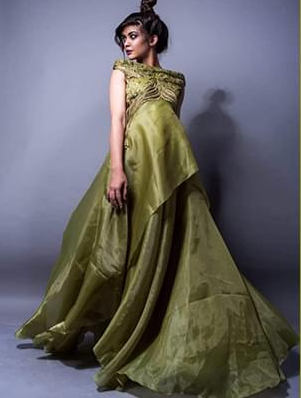
Not many greens have featured on the list of Pantone colors list but the unsuspecting PANTONE 16-0532 made an entry with a blast. Not only for clothing but for accessories, jewelry, shoes, and even interiors – this affluent color has seamless compatibility across mediums. This color has a brave soldier’s character combined with the wild nature of the forests. It is for the brutal and ferocious woman of the urban landscape, and yet it does not seem loud on the skin. From jumpsuits, co-ords, and rompers to dresses and jackets – this color has added class to all styles and outfits.
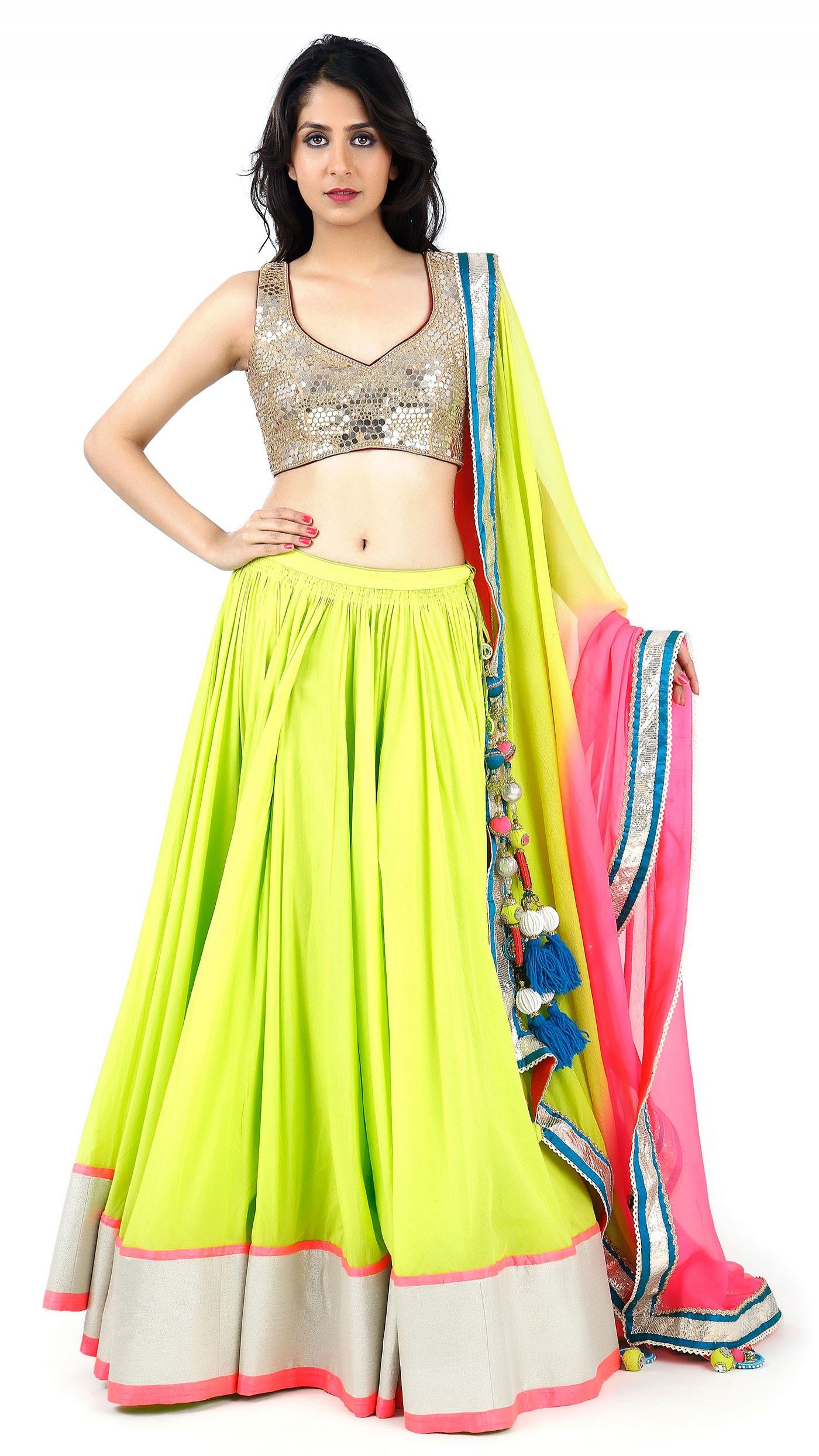
Neon Green
Like it or not, the neon always finds it’s way into a list. Be it the Andy Warhol inspired yellows and red or Nicky Minaj’s Barbie dreams. This color always becomes an inspiration to the designer’s yearning for an adventure. Neon may have gained significant attention some years ago but it’s back in a bolder, skimpier format. From thongs and bikinis to low cut dresses and acrylic jackets – the neon is here to stay. The loudest color on the runway in 2020- Neon Green is sharp, straightforward and sassy. It is not easy to team, just like the spirit of the modern-day woman. Yet, it works easily with any skin color and body type. Keep it minimal or go all out, your Neon experiment is your voice. It should not be silenced.